To understand what usability for user interface design really is, we need to start with the origins. Donald Norman is considered the father of UX design with his studies into how the design of everyday things (such as doors and teapots) can help people understand how to use objects and systems, and conversely, poor design can lead to mistakes.
We often refer to these as ”human error”, however Don’s research suggested that design could be at the core of the problem.
Jakob Nielsen is a human-computer interaction researcher & web usability consultant. He is widely known for developing Nielsen’s 10 Usability Heuristics which are the basis of computer-based system design (web sites, computer systems, apps etc.).
Together, they co-founded the Nielsen Norman group which is a leader in user experience, conducting research into usability, training and certifying UX practitioners and providing UX consulting to clients.
So for this post, we’re going to explore 10 usability pillars. While these pillars are important for any website or digital experience, we are particularly interested in them for intranet experiences. We never want our employees to be frustrated with the tools we have invested in to give them a better and more productive working life.
Users will anticipate what an experience will be like, based on their mental models of prior experiences on websites. When making changes to a design of a website, we need to try to minimize changes in order to maintain an ease of use. A simple example of this would be asking this question “Where would you automatically navigate to find a website search field?”. Almost no one would say anything other than “the top right hand corner”. So if your site design moves the search bar somewhere else, you’ll confuse your users. And the issue there is that search is a significant way in which users find information on your site – regardless of whether it is a commercial site or an intranet or something else.
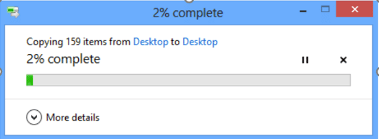
The system should always keep the user informed about what is going on, through appropriate feedback within reasonable time. Here are some ways we can ensure this happens:
The system should speak the user’s language, with words, phrases and concepts familiar to the user, rather than system-oriented terms. Follow real-world conventions, making information appear in a natural and logical order. This includes, but is not limited to:

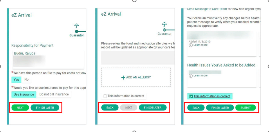
Users often perform actions by mistake. They need a clearly marked “emergency exit” to leave the unwanted action without having to go through an extended process. This is where we need to knuckle-down on the usability for user interface design.
When it’s easy for people to back out of a process or undo an action, it fosters a sense of freedom and confidence. Exits allow users to remain in control of the system and avoid getting stuck and feeling frustrated. Allow the user to control the interaction.
Users should not have to wonder whether different words, situations, or actions mean the same thing. Follow platform conventions.
Error messages should be expressed in plain language (no codes).
Even better than good error messages is a careful design that prevents a problem from occurring in the first place.

Make objects, actions, and options visible. The user should not have to remember information from one part of the dialogue to another. Instructions for use of the system should be visible or easily retrievable whenever appropriate.

Accelerators—unseen by the novice user—may often speed up the interaction for the expert user such that the system can cater to both inexperienced and experienced users. Allow users to tailor frequent actions. Provide alternative means of access and operation for users who differ from the “average” user (e.g., physical or cognitive ability, culture, language, etc.)

Dialogues should not contain information that is irrelevant or rarely needed. Every extra unit of information in a dialogue competes with the relevant units of information and diminishes their relative visibility.
Even though it is better if the system can be used without documentation, it may be necessary to provide help and documentation. Any such information should be easy to search, focused on the user’s task, list concrete steps to be carried out, and not be too large.
Online References
© 2024 Propelle Pty Ltd